Women Business Owners
Brand Identity
The Challenge
Emerging from a pandemic, and predominantly virtual first environment, Women Business Owners of Montgomery County (WBO) was ready for a refreshed brand identity that would resonate with their existing members, while also positioning the organization to attract new members.
The Solution
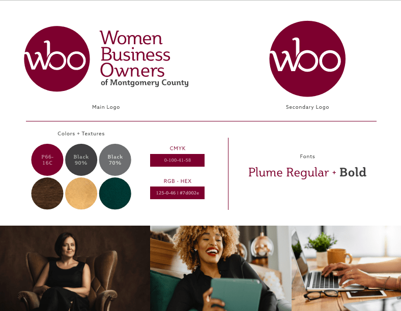
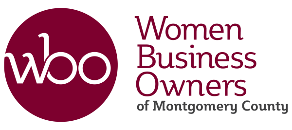
After conducting a brand assessment and understanding WBO’s goals and objectives, Spark + Buzz Communications created a series of black and white logo options for WBO to consider (you can view some of the alternate logo designs below The Spark Board). In creating a refreshed identity that modernized its previous logo, it was important that “WBO” as a shorthand was included, as well as their full name. Spark + Buzz devised a primary and secondary logo, whereby depending on application and usage, both can be interchangeable, and over time, WBO can lean on its secondary logo (emblem or logomark) as its primary forward-facing image as larger brand awareness is gained. While many colors were up for consideration, the only color off the table was pink–a stereotypical color many women’s groups tend to be associated with. The new look and feel is represented below in The Spark Board by using a richer, sophisticated color palette, accented by luxe textures such as pebbled green leather, brushed gold, and wood grain.
Spark Board
alternate logo designs
